Section Lines
Role
Design and development of new layout for checklist section and test attempt lines. Improve interactions and create new icons.
Skills & Tools
- HTML/CSS
- jQuery
- Sketch for mockups and icons
- Browserstack for testing browser compatibility
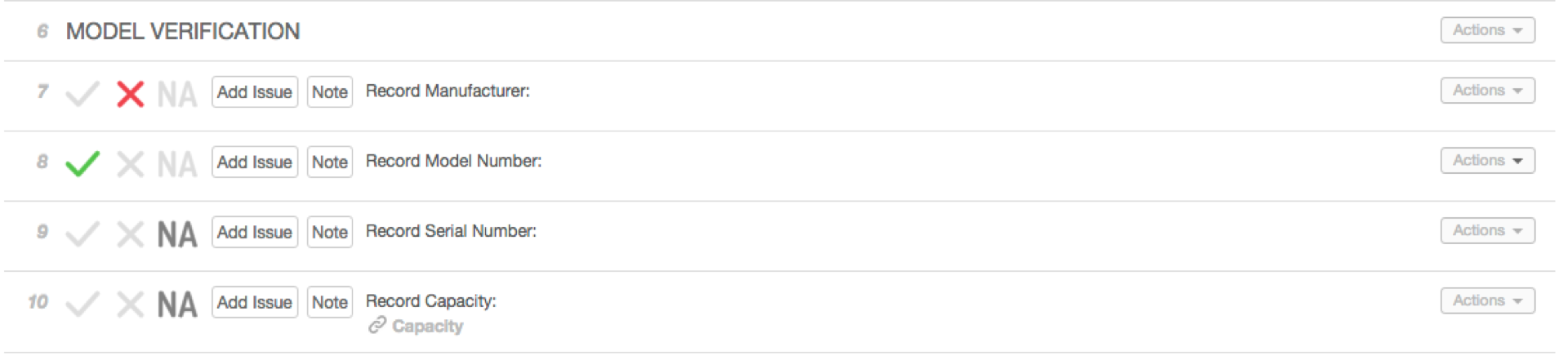
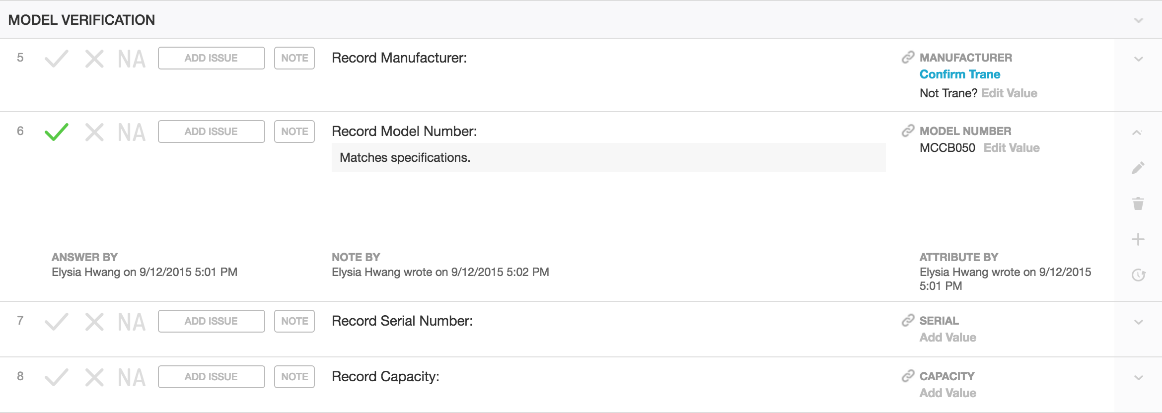
A request we often heard from our users was to add the ability to see who responded to a line in a checklist section or test attempt and when the line was answered. While this information is tracked in our history table, this information was not available for users to view.
In order to accommodate the additional details in a compact interface, we needed to take advantage of the horizontal space as well as improve the visual hierarchy of the lines. The engineers using our product often emphasize the importance of viewing as many lines at a time for scannability and efficiency. The product manager and I discussed and sketched a few ideas that would hopefully improve readability and add more detail to each line without taking away too much from the vertical real estate.
Additionally, in the current implementation, the fields for line notes and attributes were both accessible via the Notes button. As attributes became more widely used in the product, lumping them with the existing notes field no longer felt sufficient. We decided it was time to separate notes and attributes into two distinct fields.
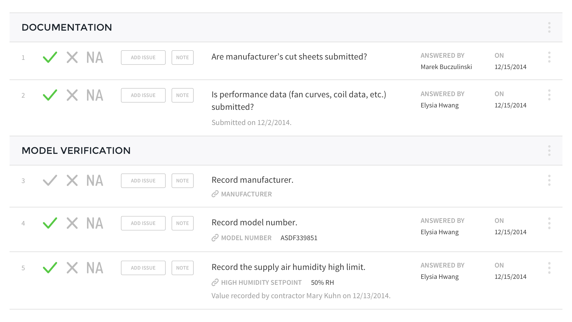
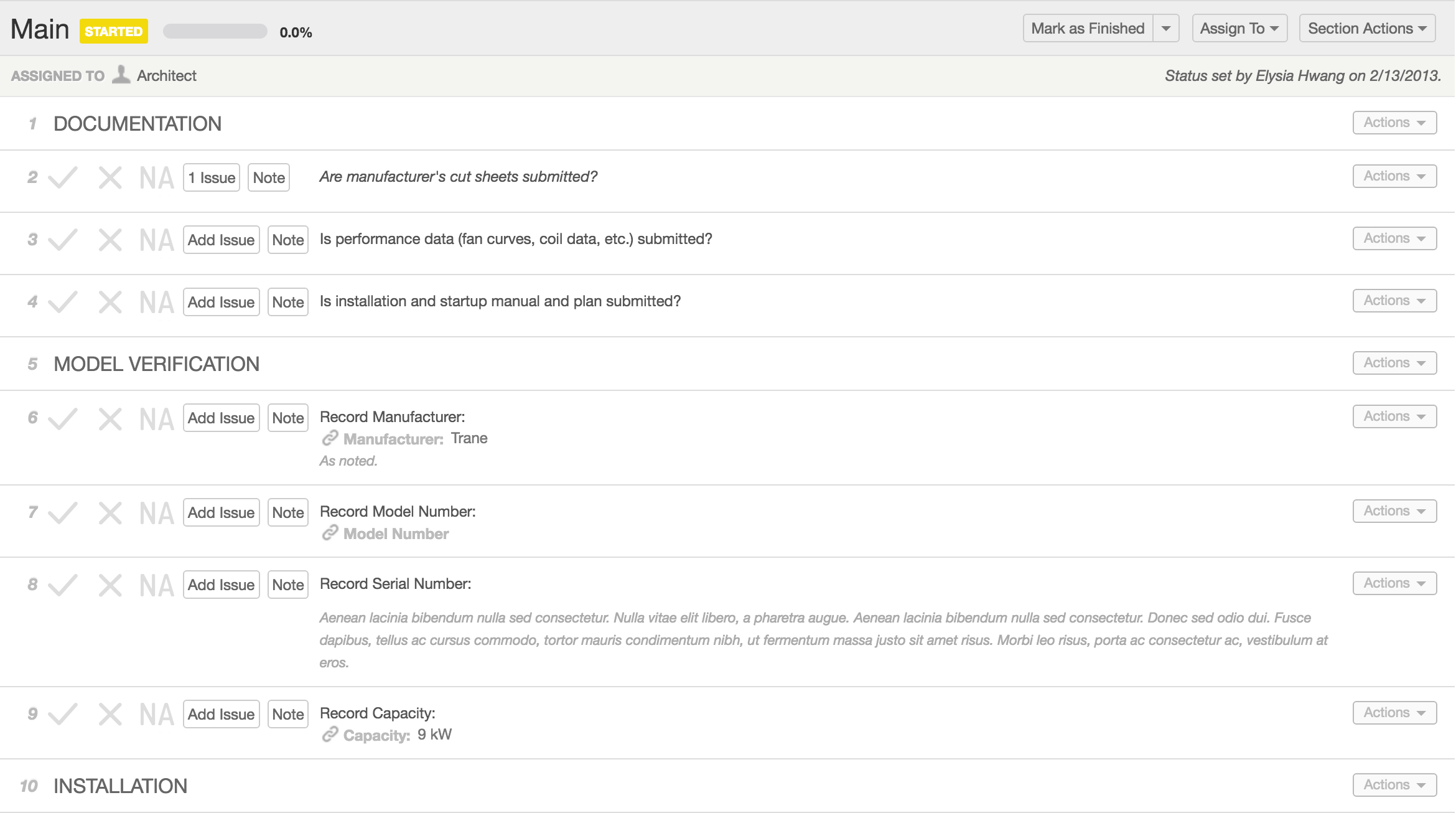
After several rounds of iterations using Sketch, I switched to the browser to implement a layout we felt was promising. When we demonstrated the new layout to a few of the engineers, however, they raised concerns over the increase in whitespace, which took away from the number of lines they could view at once. In reducing the line descriptions to a more comfortable measure[1] and separating the line note and attribute fields, we became too liberal with our use of whitespace.
The engineers acknowledged that the additional details of who answered the line and when would reduce the number of lines they could view at a time, but in our initial redesign, what used to allot them 9-13 lines was now reduced to 3-6, depending on the level of detail in the individual lines.[2]
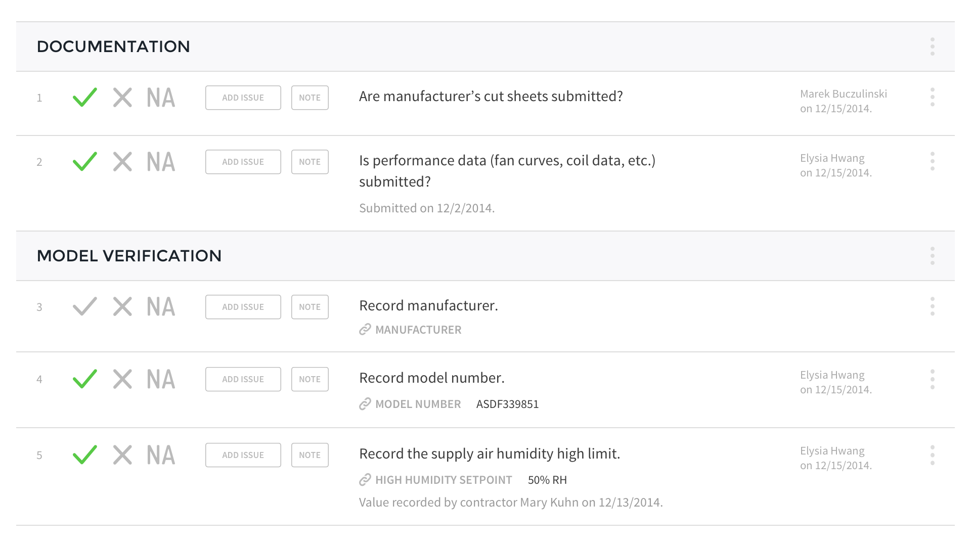
Knowing that lines in a given checklist section or test attempt are often answered by a single user, showing respondent details on each line could grow repetitive. Additionally, we found that users were generally more concerned about viewing the name of the respondent and when the answer was provided in the event of a dispute. With this information, we arrived at a new expanded lines concept that would use progressive disclosure to show respondent details only when users requested the information.
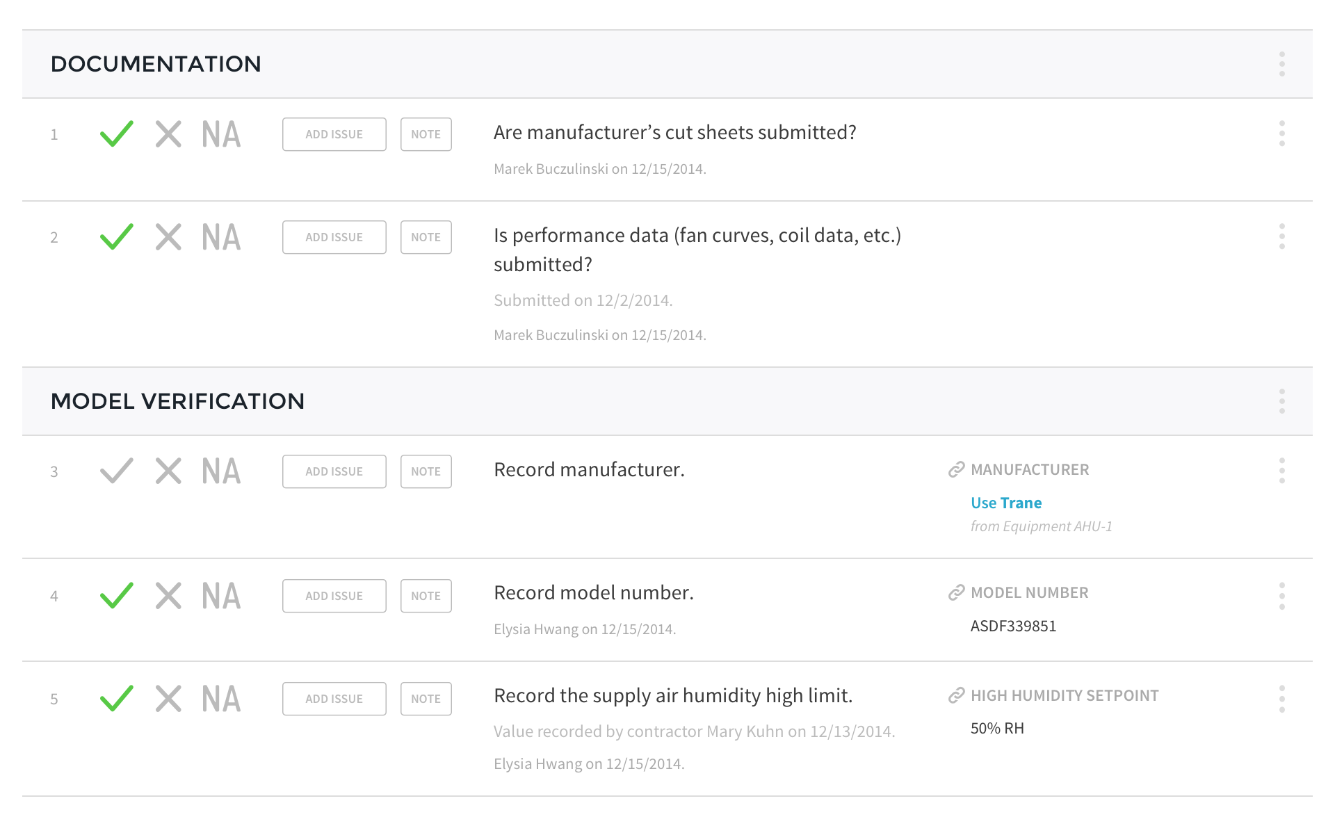
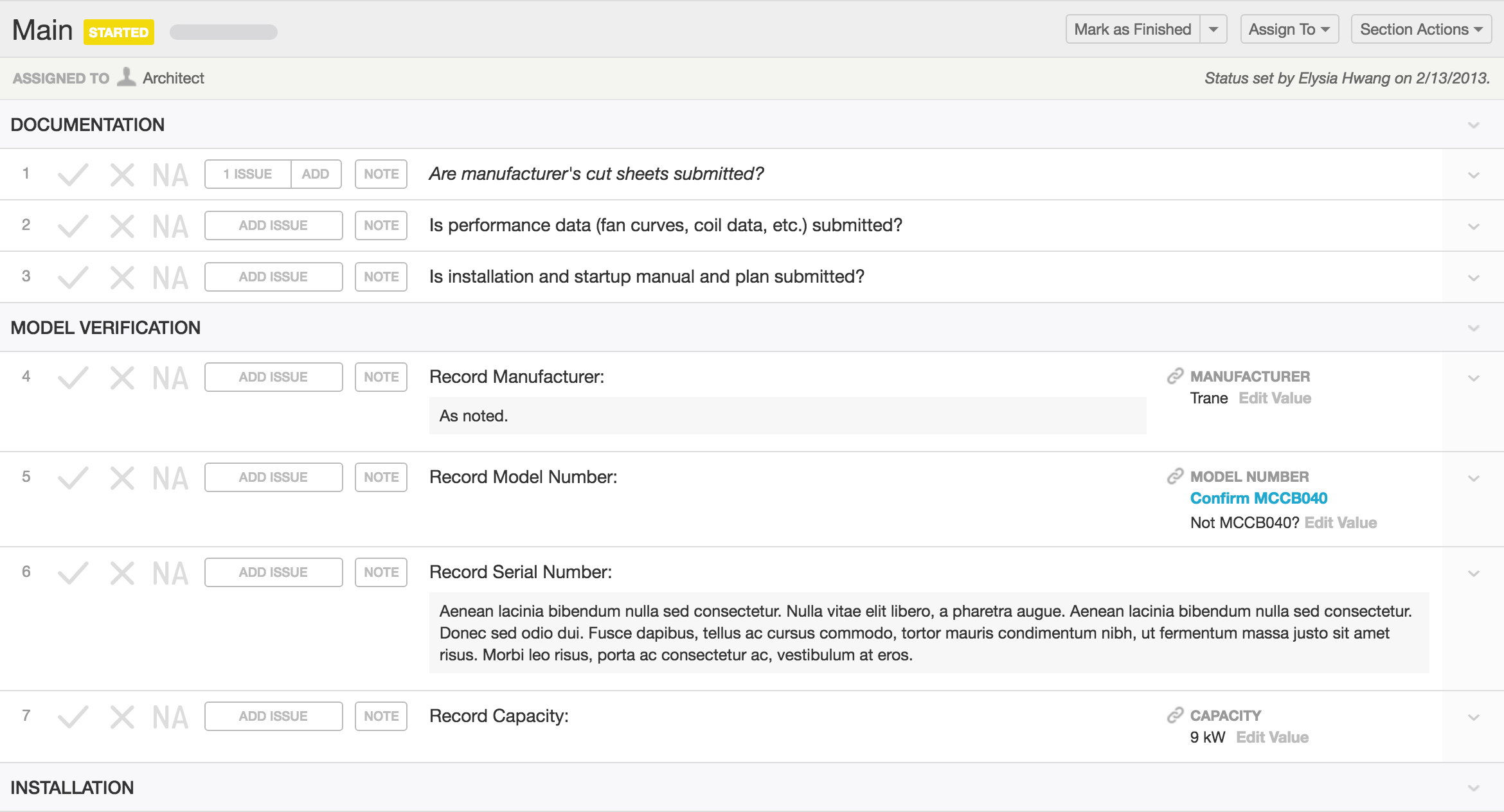
In the final implementation, we were able to improve scannability of checklist and test lines with clearer headings, a more comfortable measure for line descriptions, and the separation of notes and attributes. In some cases, the new design can even achieve more lines in the same space as the initial design.
tl;dr
... any line can now be expanded to show who answered the line, who wrote the note, and who recorded the linked attribute.
from the CxAlloy Blog[3]