Full Width
Role
Redesign and development of new layout for entire product in order to provide more vertical real estate to content instead of decoration.
Skills & Tools
- HTML/CSS
- Browserstack for testing browser compatibility
In the first half of 2016, we released the largest design overhaul to the current version of our product. This redesign occurred to address a number of budding concerns as we prepared for our upcoming feature — new sections for meetings and tasks.
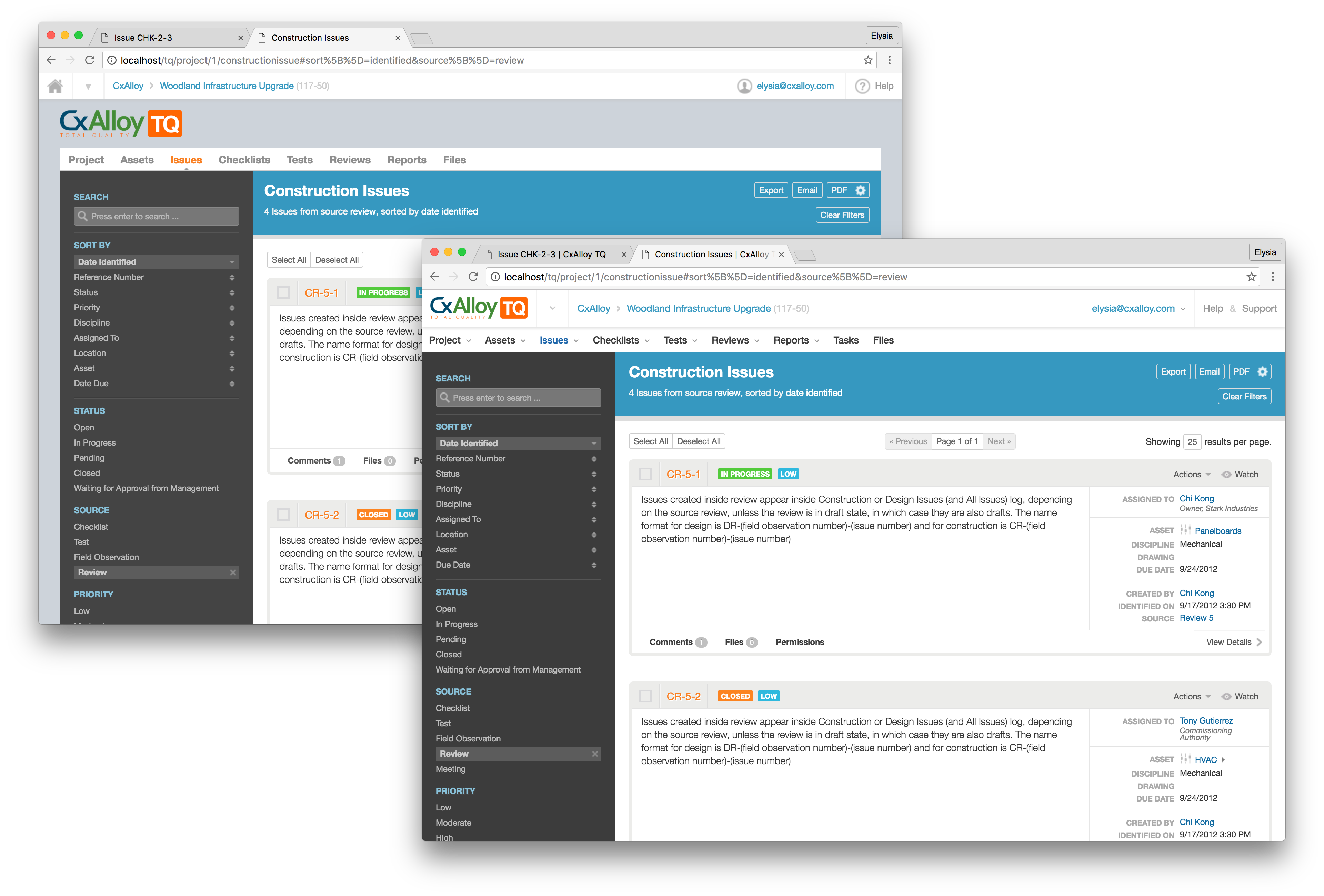
For meetings, we wanted to allow users to enter text in long-form. This would be similar to our progress reports functionality, which uses our two-pane layout. In our two-pane layout, we constrain the layout to the size of the window, a decision made largely out of convenience during the initial design of CxAlloy TQ Version 4. This layout is used throughout the site, including the sections for maintaining people, various assets, and templates.
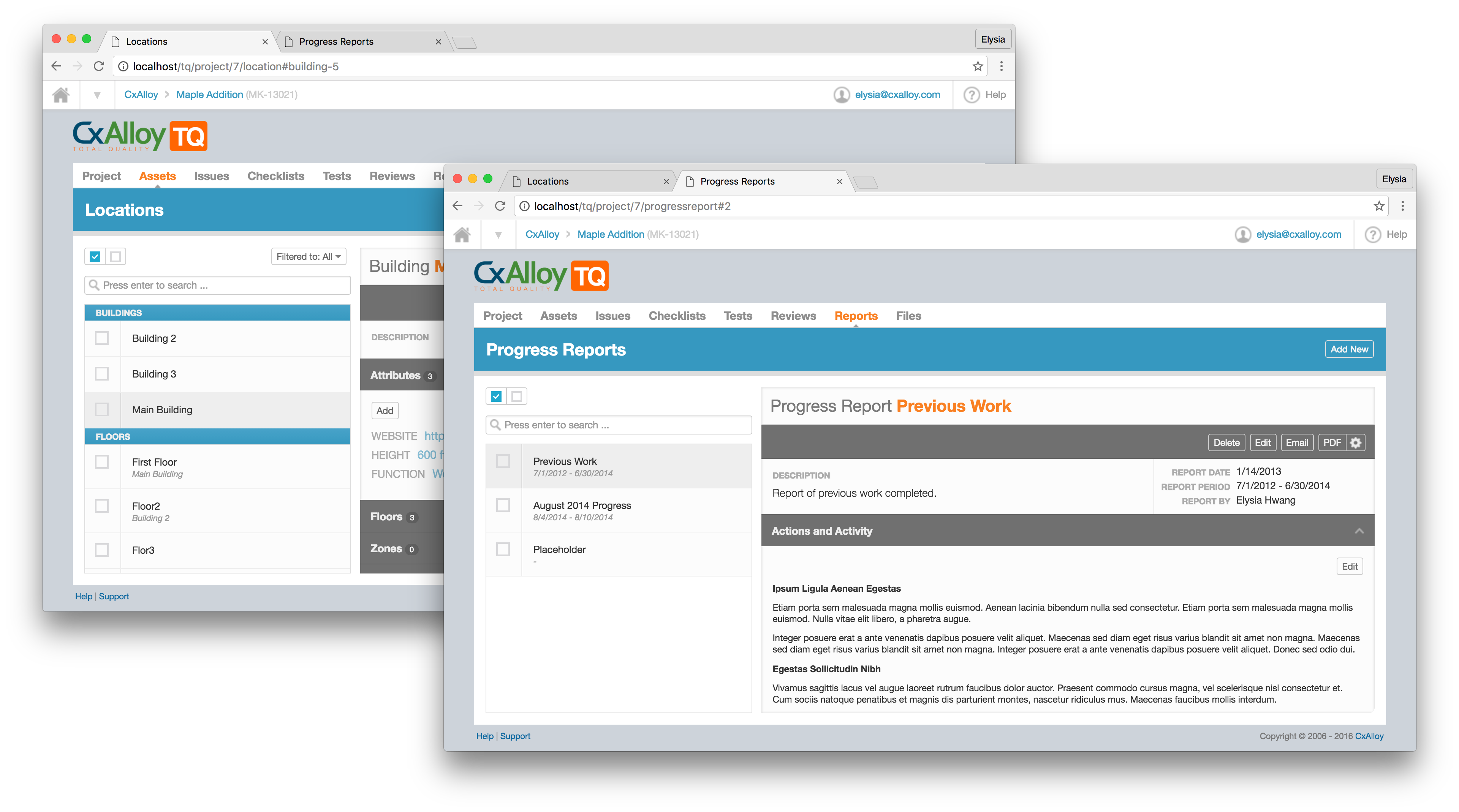
The top-level navigation and product logo took up over 100 pixels of the already limited vertical real-estate. Additionally, secondary-level navigation and headers added to this visual chrome and resulted in an increasingly confined workspace.[1] This was especially noticeable if users were multitasking with various windows on a laptop.
A full-screen redesign would not only allocate more space to actual content but also allow us greater flexibility for designing new features in the future.
In the redesign process, I started from the biggest problem area — the two-pane layout — and proceeded to work through each section. I consolidated the home icon with the product logo, both of which took users back to their home page. I was then able to remove constraints on outermost containers and expand the pages to the full width of the screen.
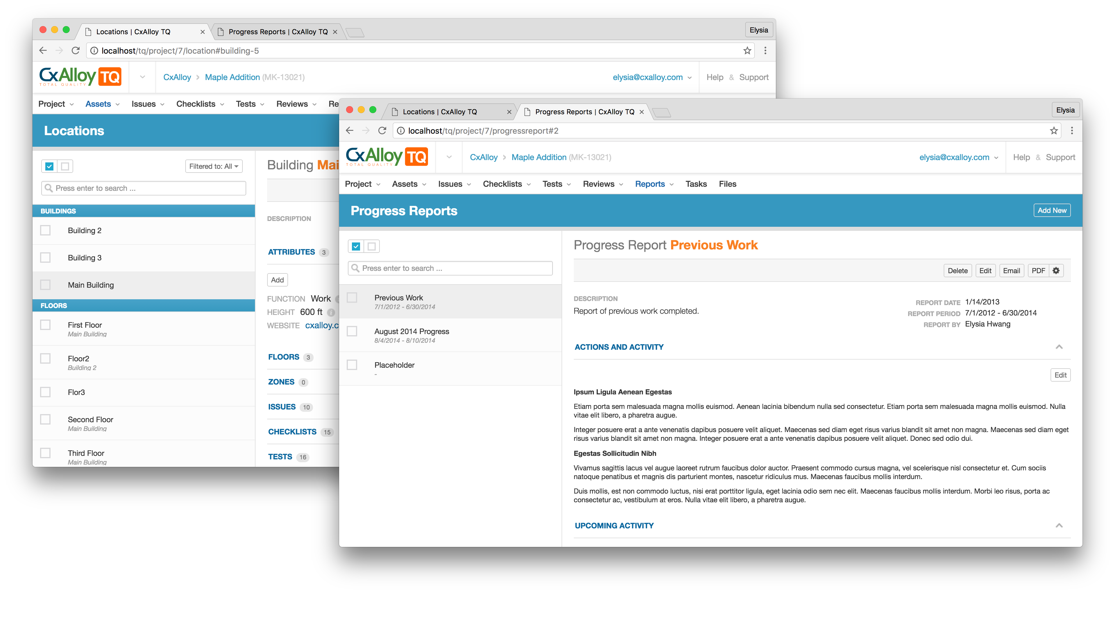
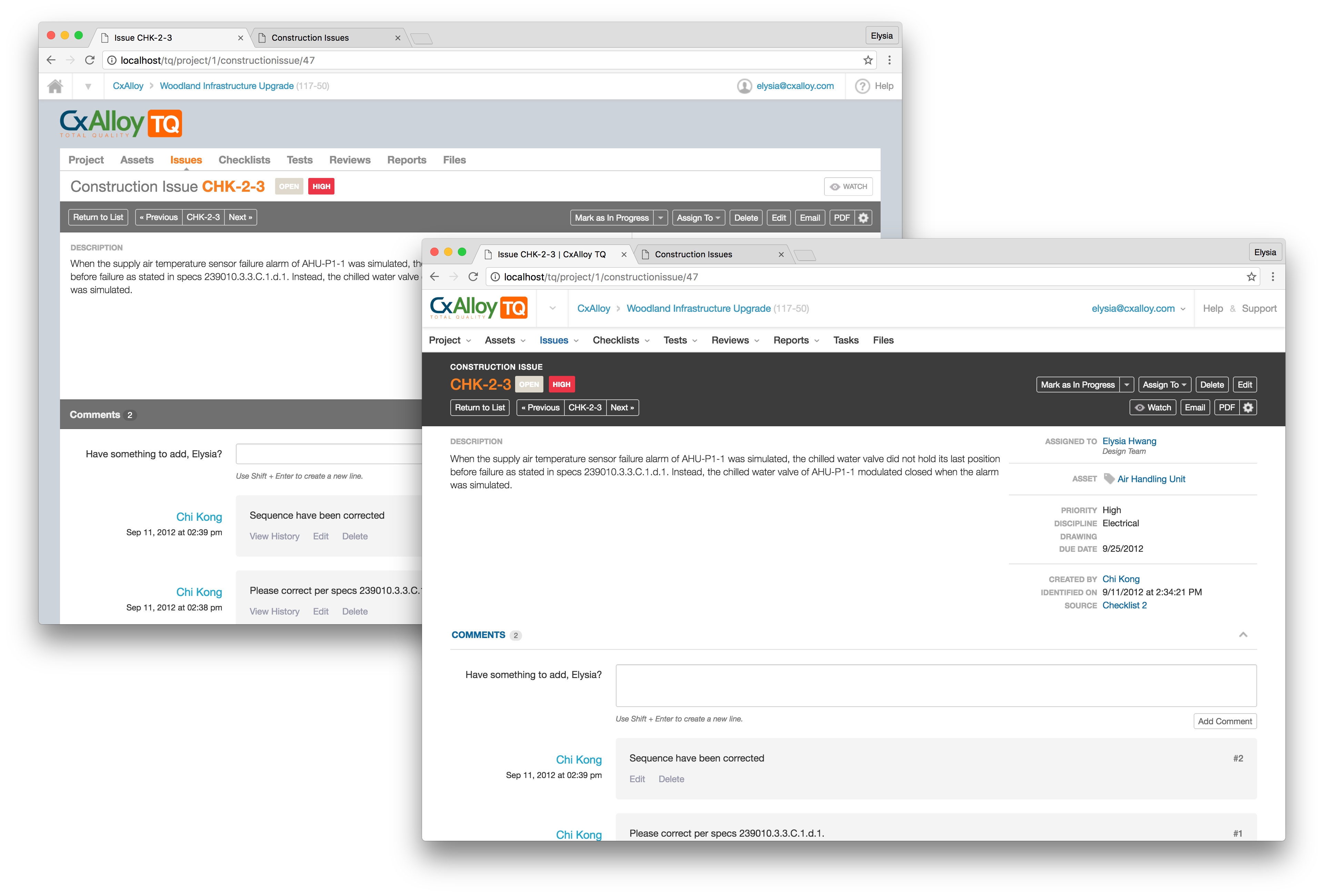
From here, I was able to tackle the simpler sections, such as the list views before finally taking on the detail views. Updating the detail views, I recognized a lack of hierarchy and consistency in the menus.
With the increase in vertical real estate, I broke the menus into two rows. The top row of buttons contain primary actions that are performed on the item and affect the actual record. The secondary buttons found below are used mostly for sharing the data of the record but not change anything. While breaking the menu into two rows took away from the increased vertical real estate we wanted to achieve, we felt that the increase in clarity warranted the change.
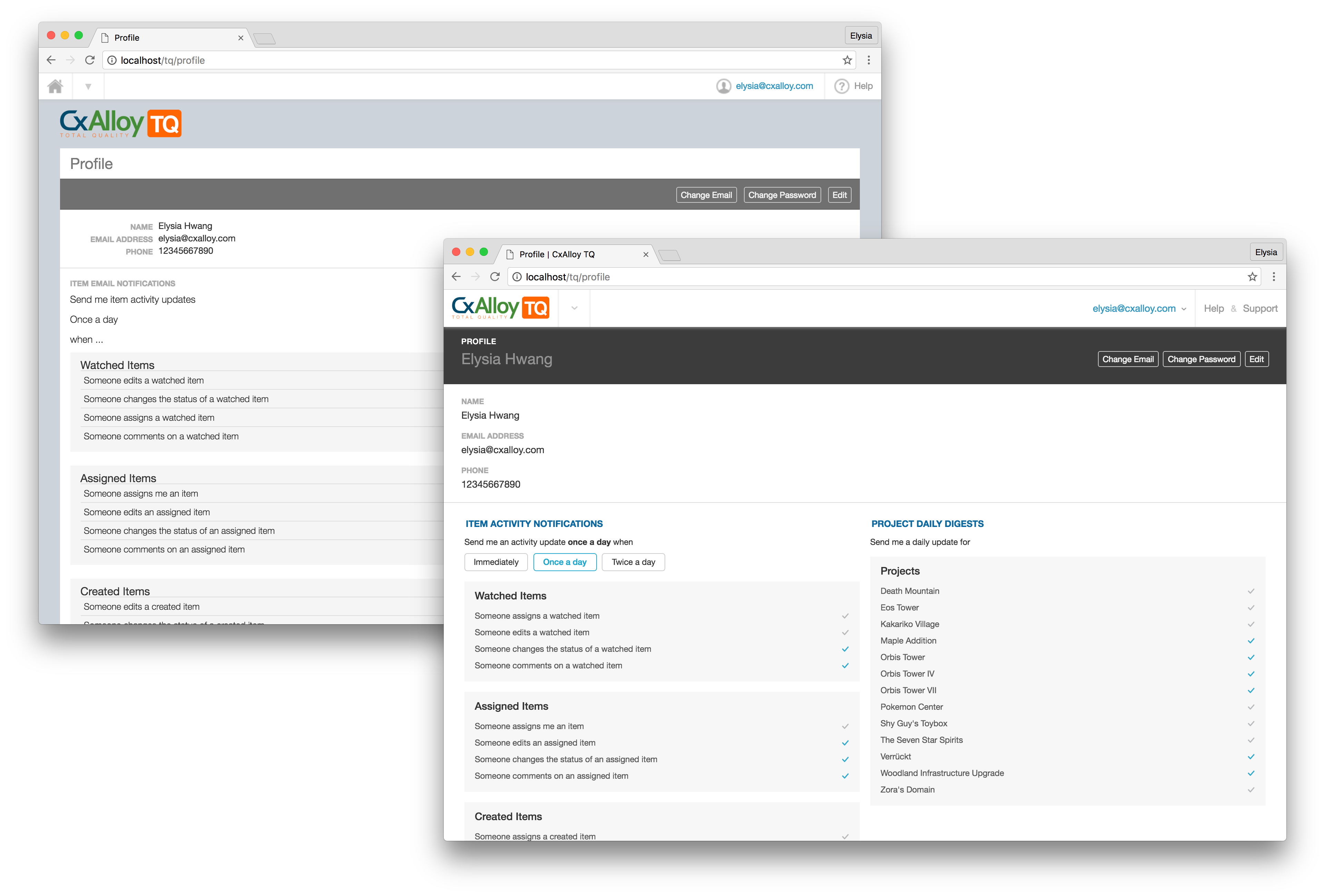
The user profile page, which uses the the detail view layout, is where users go to change their credentials and email notifications. As a page with generally less traffic, this page had not been updated since the release of Version 4.
Activity notifications are sent out when specific changes are made to any record across all projects. Project daily digests summarize all activity from the day that has occurred within a given project. These two sections also fell victim to the vertical stack, which meant that if users never scrolled past the notifications subsection, they might not discover the project digests subsection.
The final implementation of the profile page uses two columns to show both types of emails that users can choose to receive. With both sections displayed at once, users can see immediately which sections are available. Additionally, we moved to a more straightforward approach to the notifications. Instead of requiring users to edit their entire profile to update email settings, we exposed the checkboxes which makes subscribing and unsubscribing from emails both easier and more discoverable.
tl;dr
... we realized our current design can feel cramped in some places. This was particularly noticeable when typing a lot of text ...
from the CxAlloy Blog[2]
We made changes to our design that affected the entire site and made a few other improvements to hierarchy and discoverability along the way.